The Colour of the Soul recently received a gold star award in The Book Designer April cover competition. They even sent me a badge (woo-hoo!).
Most of the credit belongs to my cover designer, Michelle Arzu, not least for her boundless patience as I dithered between alternatives. As it happens, the cover design went full circle, ending with one that was very similar to the first she proposed. I thought it might be interesting to show the evolution of the cover.
This is the first one.
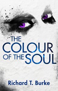
At this stage, the staring eyes came as a bit of a shock. I wasn’t sure the purple colour sent the right message.
Onto draft 2. This was an attempt to go for the menacing hooded figure. Not menacing enough in my opinion.
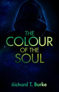
Draft 3 (below) didn’t do it for me either.
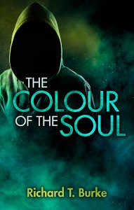
Draft 4 was my least favourite. This one screamed Young Adult at me rather than psychological thriller.
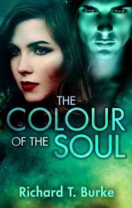
Draft 5 went back to the original concept but changed the purple eyes to blue. Unfortunately it still wasn’t threatening enough for me.
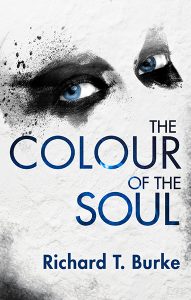
The sixth draft was one I created from the fifth. The knife with the drop of blood at the tip certainly added menace. The original concept was for the knife to be pricking the skin of one of the letters. I quite liked this but it still wasn’t quite right.
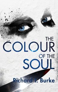
The seventh draft was starting to get close. Notice how the eyes are much darker and the whole thing gives off a sense of menace. The text still wasn’t quite right in my opinion.
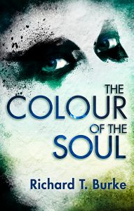
In the eighth version, the text became red and dripped blood. I deliberated over this one for a long time but eventually came to the conclusion that the blood was a bit over the top.
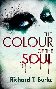
So here is the final version. This is pretty much the same as the previous one but minus the drips.
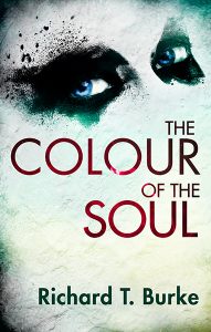
The dark colours and the red of the title were both things the judge (Kit Foster) picked up on. Here is what he said.
KF: It’s very unsettling – those eyes staring out at you! The use of eye contact is very powerful, and can draw the reader in. It breaks the ‘fourth wall’ and makes a direct connection (eye-contact!) with the potential reader. I like the sporadic use of colour here. The distinct patches of red, green and blue are given lots of power by their stark surroundings. The deep, muddy red of the title subtly reminds us of blood, upping the sense of threat even more. ★
For any authors who want to contact Michelle for their own book cover, she can be contacted at her website: www.mnarzuauthor.com
You can buy a copy on Amazon as an eBook here, or as a printed book here.
I can see the colour of your soul.


Kit Foster
Great to see the evolution of this cover! A nice end result, and very deserving of the Gold Star.
rtburke
Thank you for your kind words, Kit. The vast majority of the credit must go to my designer Michelle Arzu.